Headlines are an essential part of text and website structure. The Headlines configuration palette used on most Content Elements features a powerful array of options to cater to both your desired formatting and the semantic requirements of a well-structured web document.
Keep in mind that Page and Content Element titles are not only for the viewing visitor, but also play an important role for screen readers aiding the visually impaired and for search engine crawlers as well as other machine reading devices.
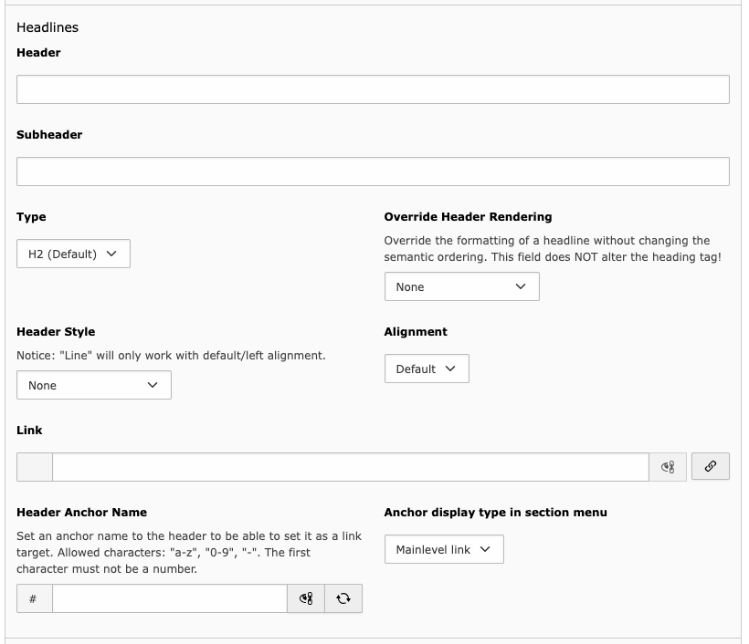
Each Configuration Field in Detail Page – H2 with Line Header Style
Header and Subheader H3, Sublevel anchor link
The field for the element’s title. Idealy, the title is short and concise.
If you risk having a lengthy title, see if you could split it in two by also using the subheader to deliver additional information in the element’s title section.
You may also leave both fields blank. However, it is discouraged to only use the subheader field.
Type H3, Sublevel anchor link
You have the choice of seven different options: H1 to H6 and Hidden. As H2 will be used most, it is set as default.
H1 to H6 represent ranks in a strict hierarchy like in a scientific paper:
H1 Main Title
H1.H2 Section
H1.H2.H3 Section
H1.H2.H3.H4 Section
H1.H2.H3.H4 Section
H1.H2.H3 Section
H1.H2.H3 Section
H1.H2 New Section
To use them correctly, just follow the instructions below: H4, H5 Header Rendering override, hidden anchor
Do not skip ranks. Each rank should only be followed by a higher rank, an equal rank, or one rank lower.
Example: H4 may be followed by
a) H2 or H3 to start a new, higher-level section,
b) another H4 for a section of the same level, or
c) H5 to begin a subordinate section.H1 should be unique on the page. Usually, the H1 page title is set in the Hero section, configured in the Edit page properties form. The H1 option is still available for Content Elements for the case that the Hero section might not be used.
Do not use the Heading Type to achieve a certain font size or weight. Use the Override Heading Rendering field for this instead.
Override Header Rendering H3, Sublevel anchor link
Use this field to disguise your semantically correct heading as one of another level. You have the whole choice from H1 to H6 and it won’t affect machine reading.
Use Screenreaders only to hide the heading from view, but not from machine reading.
Header Style H3, Sublevel anchor link
- None
Default heading styling.
- Line
This will draw a line from the last character of the heading to the right border of the heading element.
- Preceeding separator
This will draw a horizontal line between the preceeding content element and the heading.
- Border left
Adds a vertical line on the left of the heading. This is adapted from the old TUM website corporate design.
- Arrow right
This appends an arrow to the heading.
Alignment H3, Sublevel anchor link, aligned right
Use this field to align your heading either left (default), centered or right. Or simply don’t, since the TUM corporate design discourages any alignment but left.
On a sidenote, most header styles like Line won’t work with any other alignment than left.
Link H3, Sublevel anchor link, Link set to "#"
Choose a target to link your heading to. External links will automatically be marked with a symbol.
Header Anchor Name H3, Sublevel anchor link
This field will update itself when the Header field is set. You may override its value by clicking on the eye/chain symbol or refresh it using the circular arrows.
This field’s value should be unique on the page. If it isn’t, the system will automatically append a number.
The value of this field will only appear in the website’s url if you use a link of the “On this page” menu, so the anchor name may be anything. However, using the Header field’s value creates a speaking web adress.
Notice that this field also appears in some container item palettes, but won’t be used inside containers.
Anchor display type in section menu H3, Sublevel anchor link
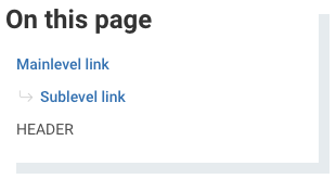
Choose a display type for the content element’s title in the section menu (Table of Contents/"On this page").
Mainlevel link (default) will show the link.
Sublevel link will indent the link and add an arrow, so that the link is clearly subordinated.
Header will display the anchor as an unclickable heading. This can be used if the element features no additional content is directly apart of the heading and is immediately followed by lower level titles. An use-case for this are the Team pages if the research personnel listing is subdivided in postdocs and doctoral candidates.
Hidden will not show the title in the section menu, evidently.